Brand Identity Concept
Legacy Wealth & Health
LLC
Securing Your Tomorrow, Today
Explore
Most independent insurance brokers default to generic blue-and-gold palettes that scream "corporate." Your brand should do the opposite: lead with your name, your reputation, your personal relationship with every client.
The design places your handwritten signature as the dominant visual element, with the agency name serving as a supporting institutional anchor beneath it. This says to your clients: "You're working with John. He happens to run Legacy Wealth & Health."
The color palette avoids the tired navy-and-gold of financial services. Instead, deep teal grounds the brand in trust and health, while burnished copper conveys legacy and warmth without the cliché of metallic gold.
The signature sits above the agency name, connected by a copper accent line. This hierarchy makes you the face, with the LLC providing institutional credibility beneath.

 Favicon · Social · Watermark
 Favicon · Social · Watermark
Deep teal replaces the overused navy blue of financial services. Burnished copper evokes legacy and permanence without resorting to metallic gold. Warm sand and cream keep everything approachable.
Cormorant Garamond for display and brand text -- refined, warm, with classical proportions that convey legacy. Outfit for body and UI -- modern, friendly, and highly readable at all sizes.
It works across all three service lines. Medicare? That's securing health care for tomorrow. Life insurance? Securing your family's financial tomorrow. Trusts and annuities? Literally securing tomorrow's wealth today. One slogan, every conversation.
The comma creates a pivot. "Securing Your Tomorrow" sets up the promise. "Today" is the call to action. It has natural rhythm and sounds like something you'd say in person -- not something a marketing committee wrote.
It's personal in scale. "Your tomorrow" -- not "the future" or "generations." It speaks to the individual sitting across from you, not an abstract concept. That matches your one-person, high-touch approach.
You asked for alternatives to "Agent." Here are three options ranked by how well they balance professionalism with approachability.
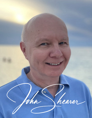
Two approaches: one using your headshot for maximum personal connection, one using the signature script for a cleaner, more formal feel.
How the logo system works across different formats and backgrounds.